Component libraries for events and data CMS
Data reporting / CRM / CMS
What
Component libraries, design kits, tomay-to, tomah-to...
I'm talking about the Figma file which contains the Holy Grail of page components, styles and elements for a product, which should be used to maintain consistency of product design work.
As well as helping myself to make my own job easier, I created these component libaries for other designers who might have to do work for my products. Having had to use other designers' component libraries to design for a platform which I have never seen and don't have access to, I have a well-deserved appreciation for how important a good component library is.
Why
For a long time, I was the only Product Designer for Eventsforce, Mint+ and Data Engine so I was reusing the same Figma elements and I knew where everything was and how things should be used.
When the Product Design team was formed with the aim of getting more designers, it became inevitable that other designers would need to work within my product files and since people tend not to be psychic there came a need to set up component libraries for each of these products.
I wanted to develop my Figma layout skills so this was a great opportunity to recreate all the useful elements properly - it turned out to be an amazing learning opportunity as each component presented its own challenges.
It was also a great reason to take a step back, see which components are needed, which are common and which I know are useful. It's just the Right Thing To Do.
How
All three products were already live and had been for years, were being used by customers, and things like text and colour schemes had already been decided by non-designers so I was not able to create a standard 'correct' component library for each - I had to create them for the how the products currently worked and how they already looked. If I didn't do it this way, the designs that I'd be creating with them would be inconsistent with the end results in the product and cause confusion for the developers and QA teams.
This means the libraries have inconsistencies - colours for example don't form a nice even graduation of tones, because they were never planned out like that during initial product design.
I had guidance from my manager on the standard structure, layout and visual style of the component library so that my files would be consistent with the ones that he had created for other products.
- I started with existing font styles and colours
- I created the components for the most common elements, testing them along the way and creating variants where necessary
- I then went back to the products to see which less common elements needed to be added
- I moved on to common page elements like headers, footers, emails, mobile views, tables and contents areas
- Along the way, if I'd figured out a better way to do something I'd go back and improve what I'd done already elsewhere while it was still fresh in my mind
- My final task was creating page examples - screens with the page structure components in the right place so that I don't have to recreate a page every time I want to start a new Figma file
- I added some notes about usage and context where relevant
Result
Is a component library ever fully complete?
I have been adding items and refining existing components as I design variations to standard features in my design projects.
As my Figma knowledge improves I have been going back and revising components to make them more stable and easier to use. I won't lie, there have been times where I have thought 'why the heck did I do it like THAT?"
Design
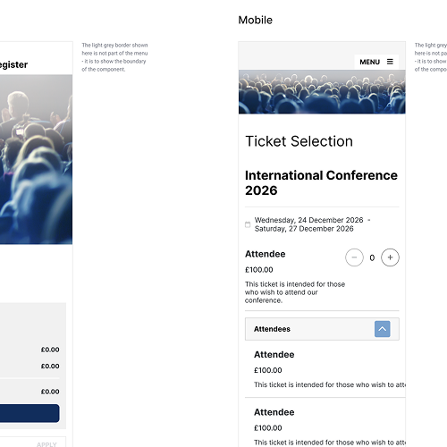
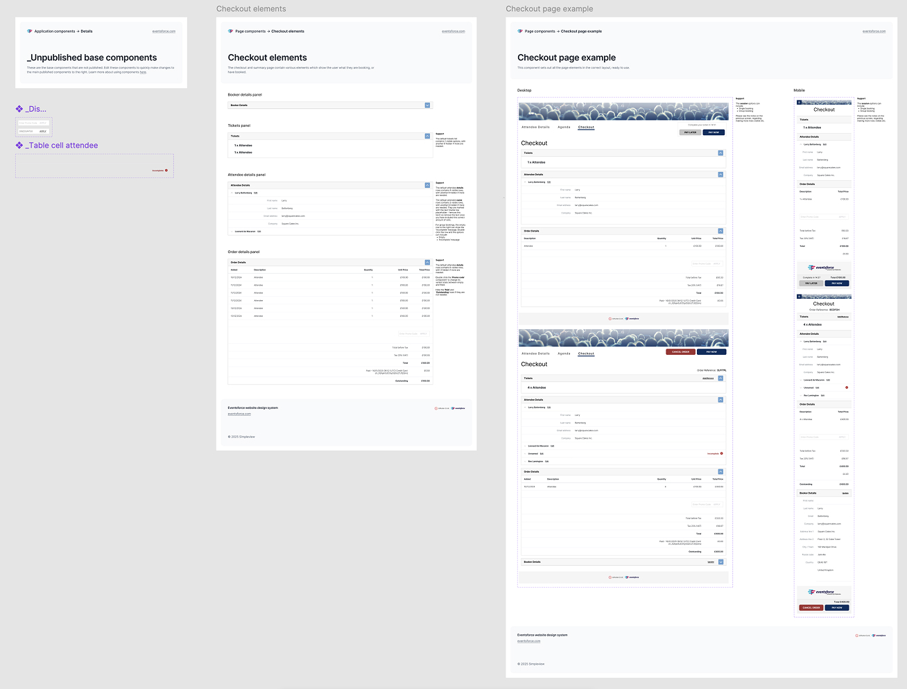
Eventsforce front-end component library
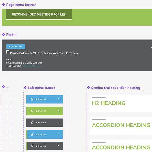
Eventsforce back-end component library
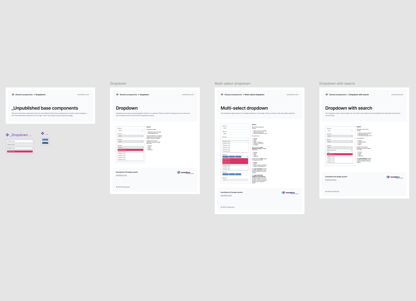
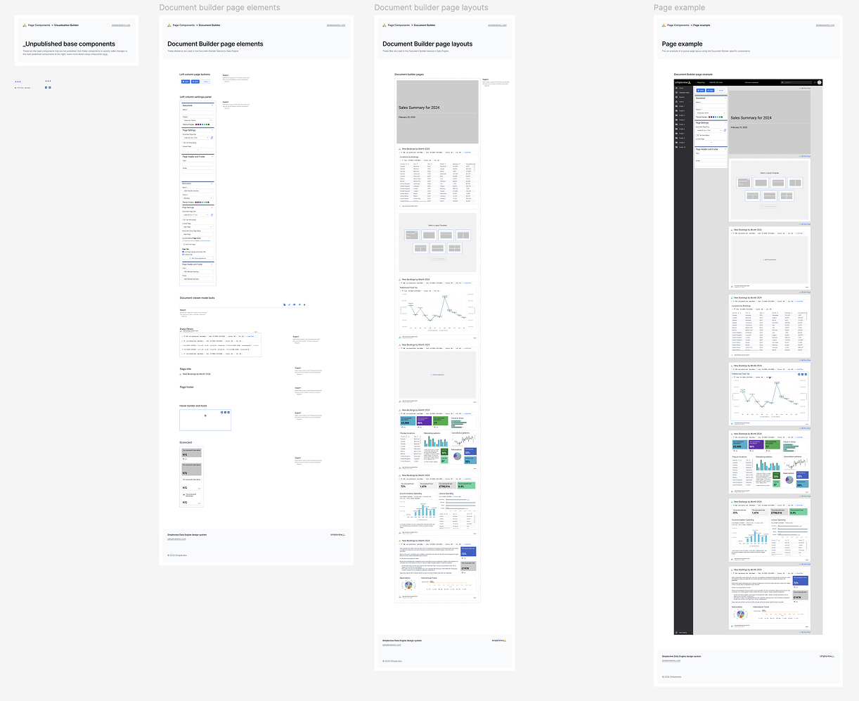
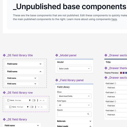
Simpleview Data Engine component library element example
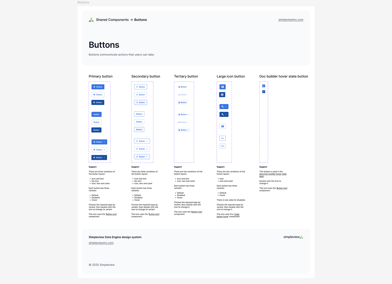
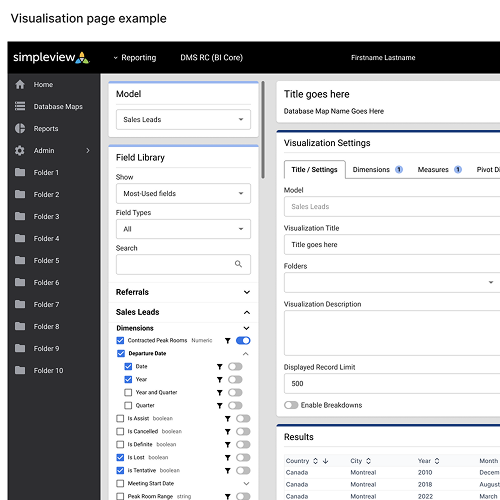
Simpleview Data Engine feature-specific component library