Data Visualisation Builder
Data Reporting / Simpleview Data Engine
What
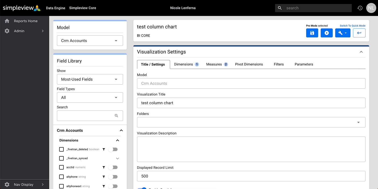
The Data Engine is Simpleview’s data reporting platform.
I was given the opportunity to work with the team of five Product Managers and one Lead Developer, all of whom are based in the US. It was a live, fully functioning platform being used by clients when I arrived, so I had to work what was already there (and mainly designed by the developers, one of whom is now the Product Manager).
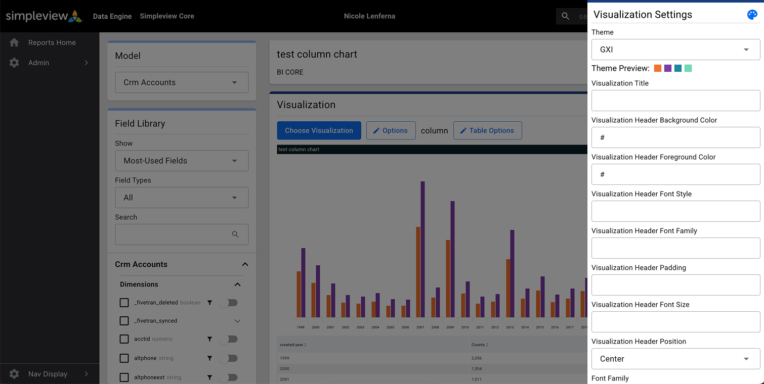
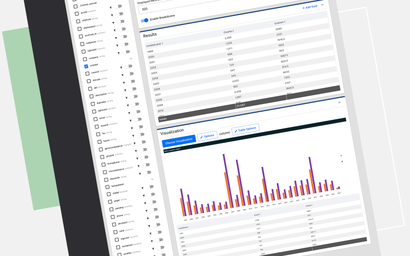
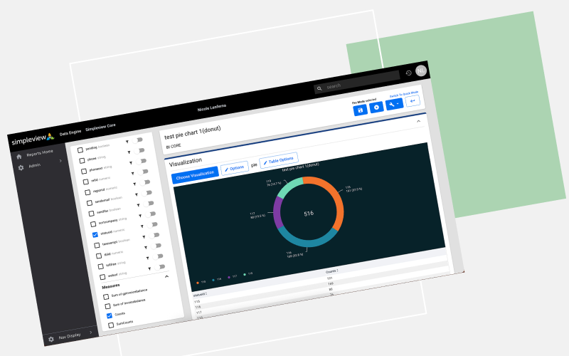
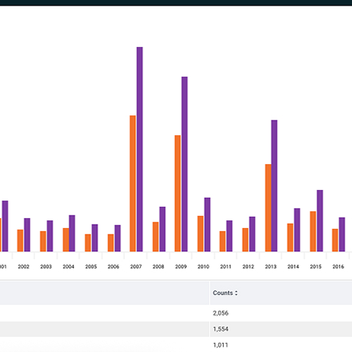
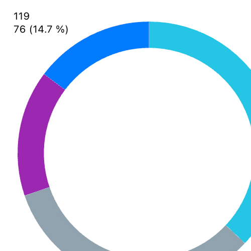
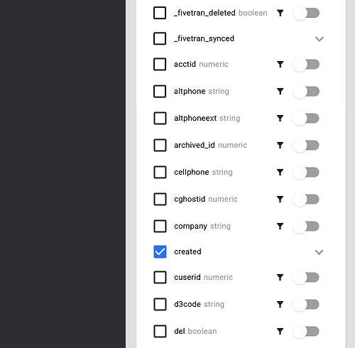
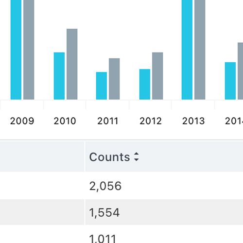
The Visualisation Builder is the functionality which allows users to create new visualisations (charts, graphs, data tables) using custom data configurations.
Why
- The team needed a designer to improve the visual appearance of the interface
- They wanted ideas for developing sensible user journeys - as I had not developed the product in the first place, it was easier for me to think outside the box (although, not all of my ieads were good ones!)
- A user-focused perspective was needed in the decision-making part of the product development - when the team know a system so well, having someone like me with no data experience helped us all to define what made sense and what needed to be simplfied
How
- I have been working with this team since 2021, having collaborative weekly video call meetings to go over the work done
- I refined what was there already with aesthetic changes like spacing and proportion
- I designed new features and how they would integrate into the current system with minimal disruption to development
- When new features were needed, I discern the user journeys, make suggestions for how it could work, and create high fidelity mockups based on my ideas
- We would then go over the mockups in the meetings, discuss feasibility and then refine the designs and ideas over each week
Result
- I designed a new visualisation type - the progress bar, which is in the platform
- I created a Figma component library incorporating the assets needed for design work - this is a work in progess as new fields and elements are addeed to the product
- I redesigned the scorecards stats visualisation to be visually more interesting
- I thought about data visualisations so much that a completely new chart type came to me in a dream! I am not even kidding (I call it The Flower graph and for some reason the rest of the team haven't added it ot the chart type selection...)
- Overall, the Visualisation Builder interface is tidier - things line up, and are nicely spaced etc.
Design
Settings
Visual settings