Creative data report design
Data Reporting / Simpleview Data Engine
What
This was an exercise in taking a more visually creative look at data document design.
I'm not going to lie, this project was SO MUCH FUN. After spending years looking at the same data interfaces, it was wonderful to be able to have some fun with my product.
I am so grateful to be working with a team of Product Managers who are so open to different ways of doing things, and who understand that design is something to be used to one's advantage. Of course it wouldn't be practical to change the product to be able to create what I came up with - we were looking for small wins and the nuggets of ideas which could work as iterations to what we already have.
Why
The Document Builder feature allows users to create reports which are more than just a bunch of charts on a page, but we wanted to push the boundaries, have a fresh look at what we COULD offer and then work backwards to develop the methods and journeys which would allows users to create them for themselves.
Our first iteration of the document builder feature is quite basic and templated - as a result the documents end up looking quite similar so we decided to do an exercise in creative report design to see what the possibilities are, and what we can transfer to future iterations of the document builder.
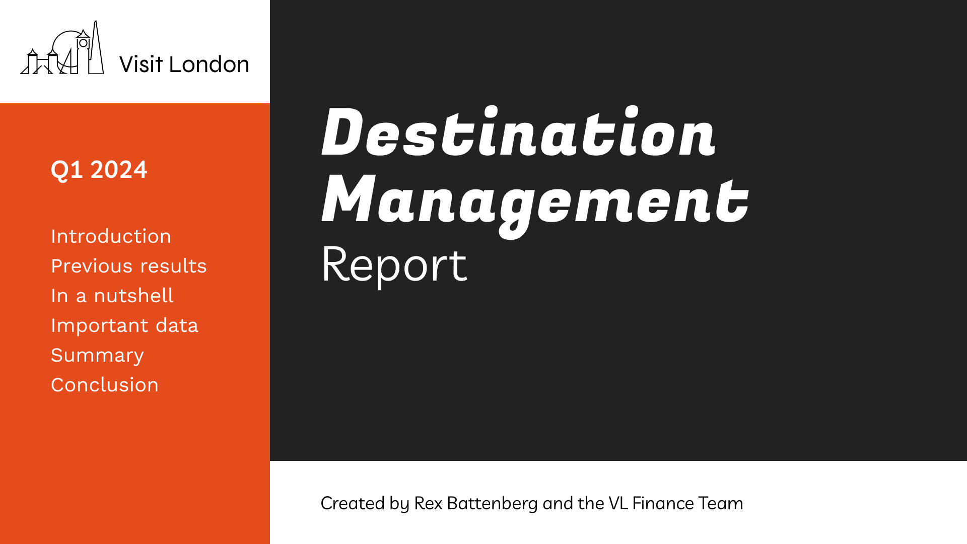
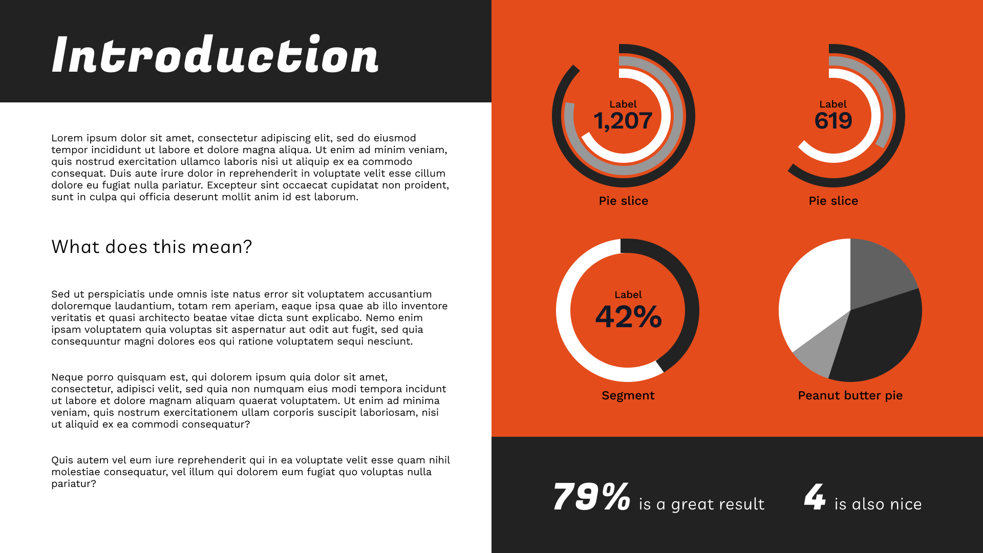
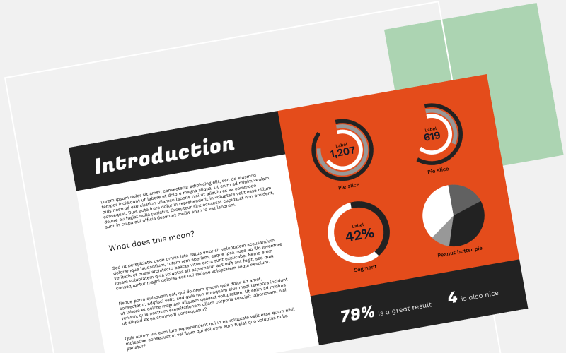
Specifically, I was asked to review the scorecard visualisation type as it's one which lends itself to more creative ways of showing data - we can use colours, font size hierarcies and icons so it felt like an easy way to make a report look more visually interesting.
How
I spent some time looking at examples of report and dashboard designs, from design inspiration sites and from companies like Tableau.
From there, I collected some ideas which could be carried across to our Data Engine platform and mocked them up in the Data Engine context to discuss with the team (giving myself some fun work in the process!).
I also experimented with ways of creating an interesting report design with very little input or files from the user - using just a colour scheme, we could use semitransparent shapes for example to create imagery, texture and interest without the user having to create design or imagery themselves. This would be especially useful for users who need something up and running quickly.
Result
We did not choose any designs to be recreated specifically in Data Engine, but it did direct us towards a cleaner, more refined default style which has been partially implemented in the platform.
It inspired a more modern design for the scorecard visualisations.
Looking at visually different and interesting ideas was a great visual 'palate cleanser' for all of us - we have been looking at the same interfaces for ages so it felt like a little holiday. And I really enjoyed the creative freedom of the task.
Designs
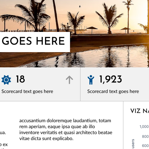
Dashboard style - fun
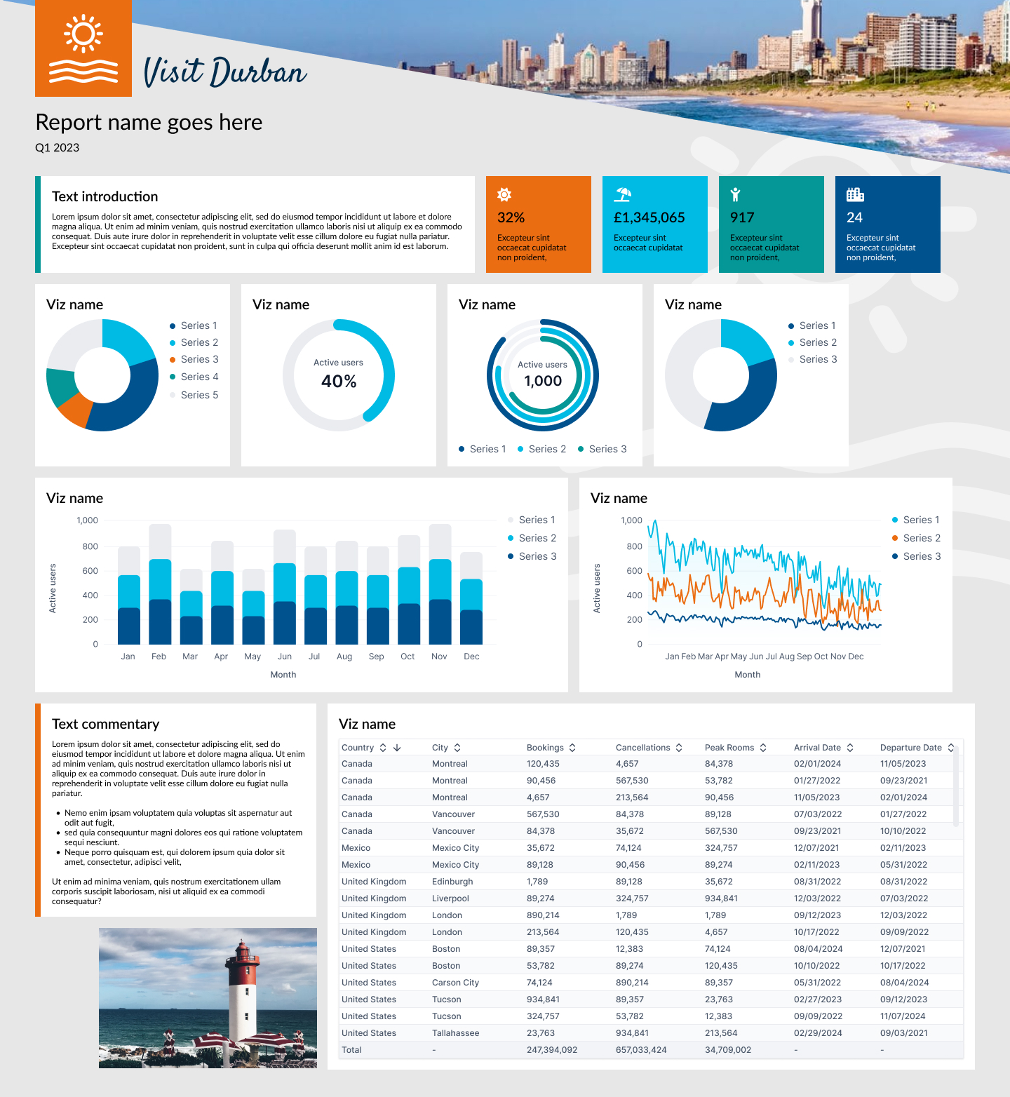
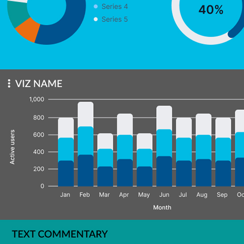
Dashboard style - colour block
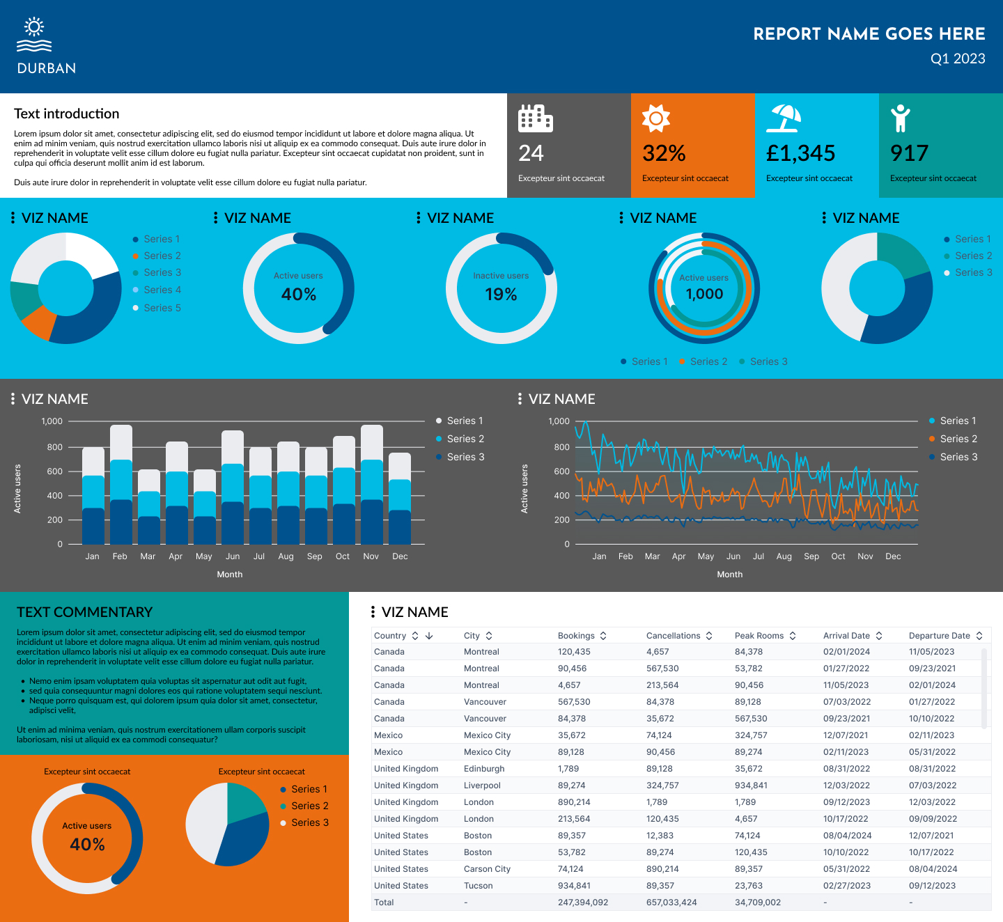
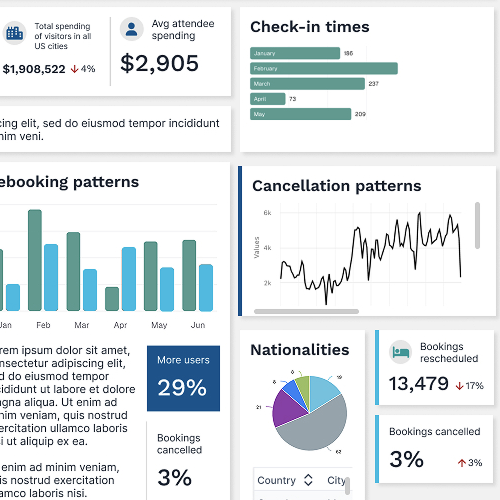
Dashboard style - classic
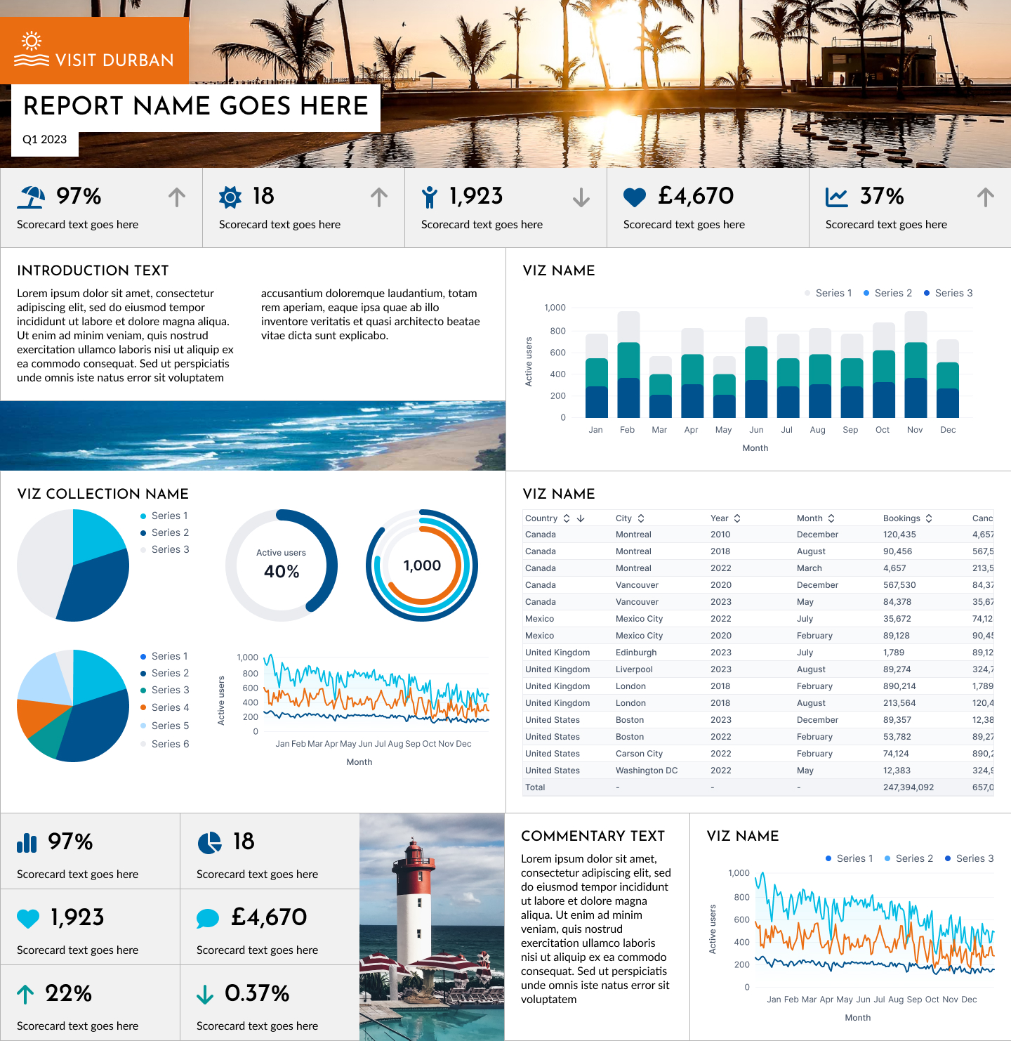
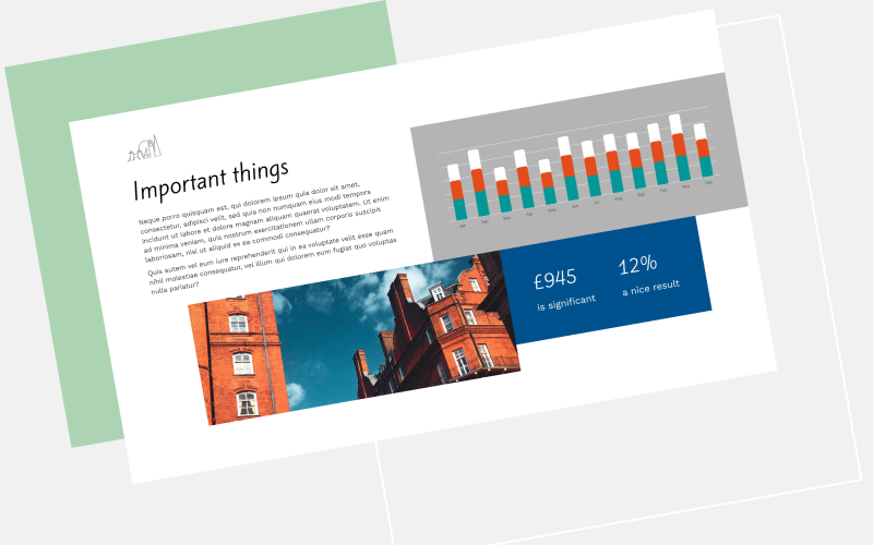
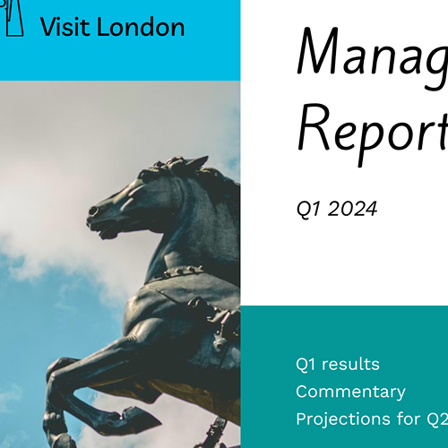
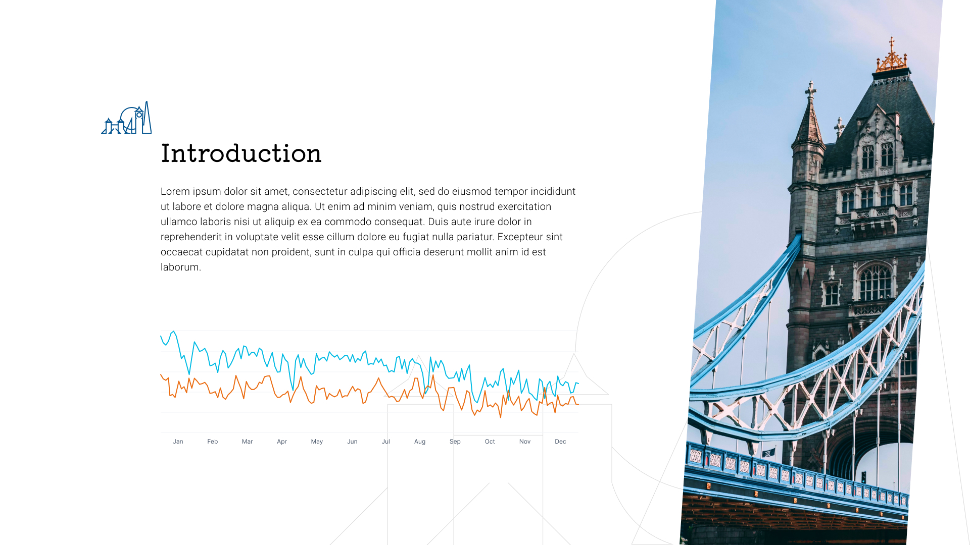
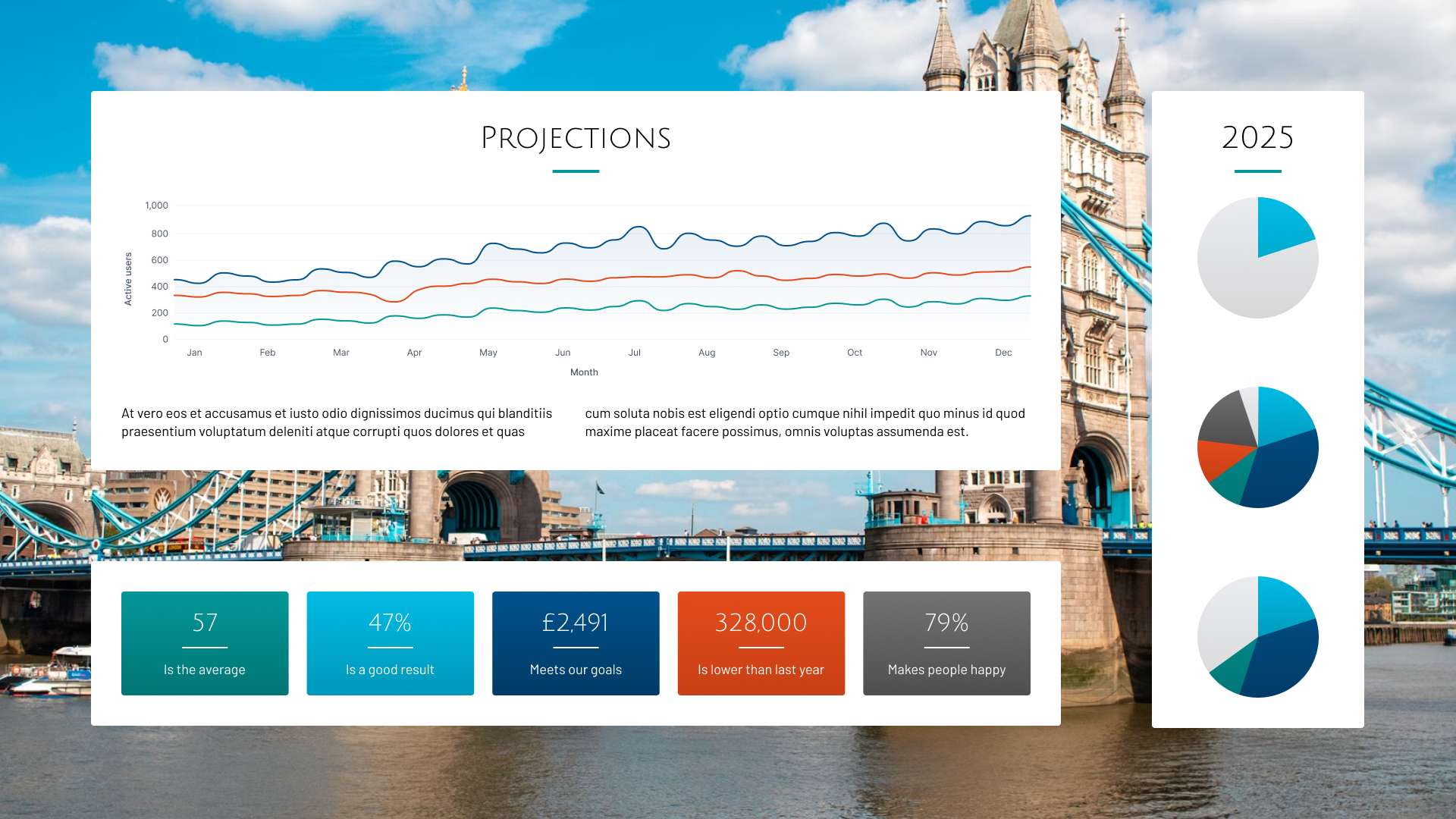
Annual report style - photos and outline shapes

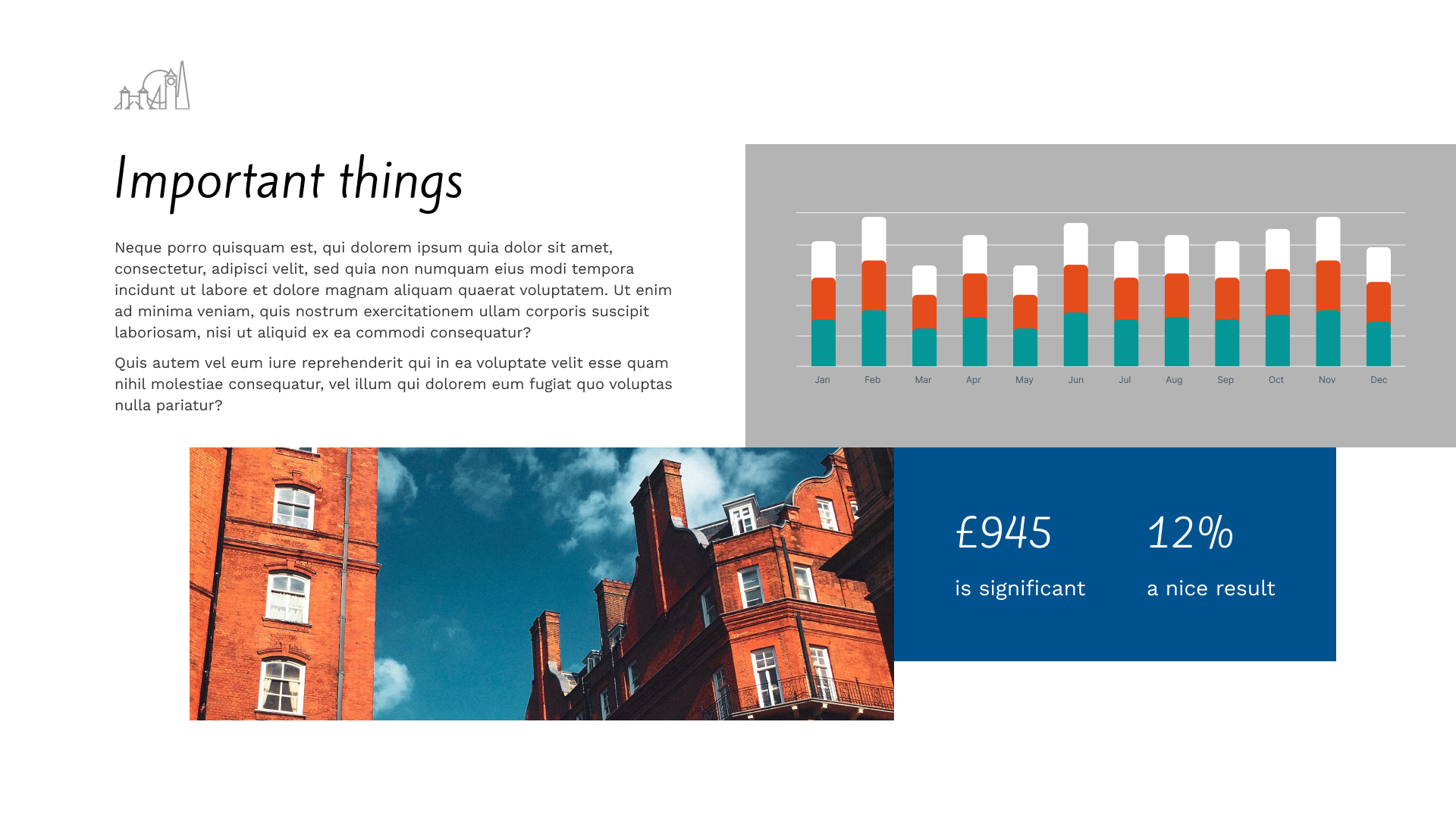
Annual report style - photos and blocks

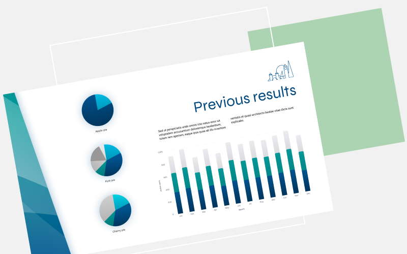
Annual report style - classic

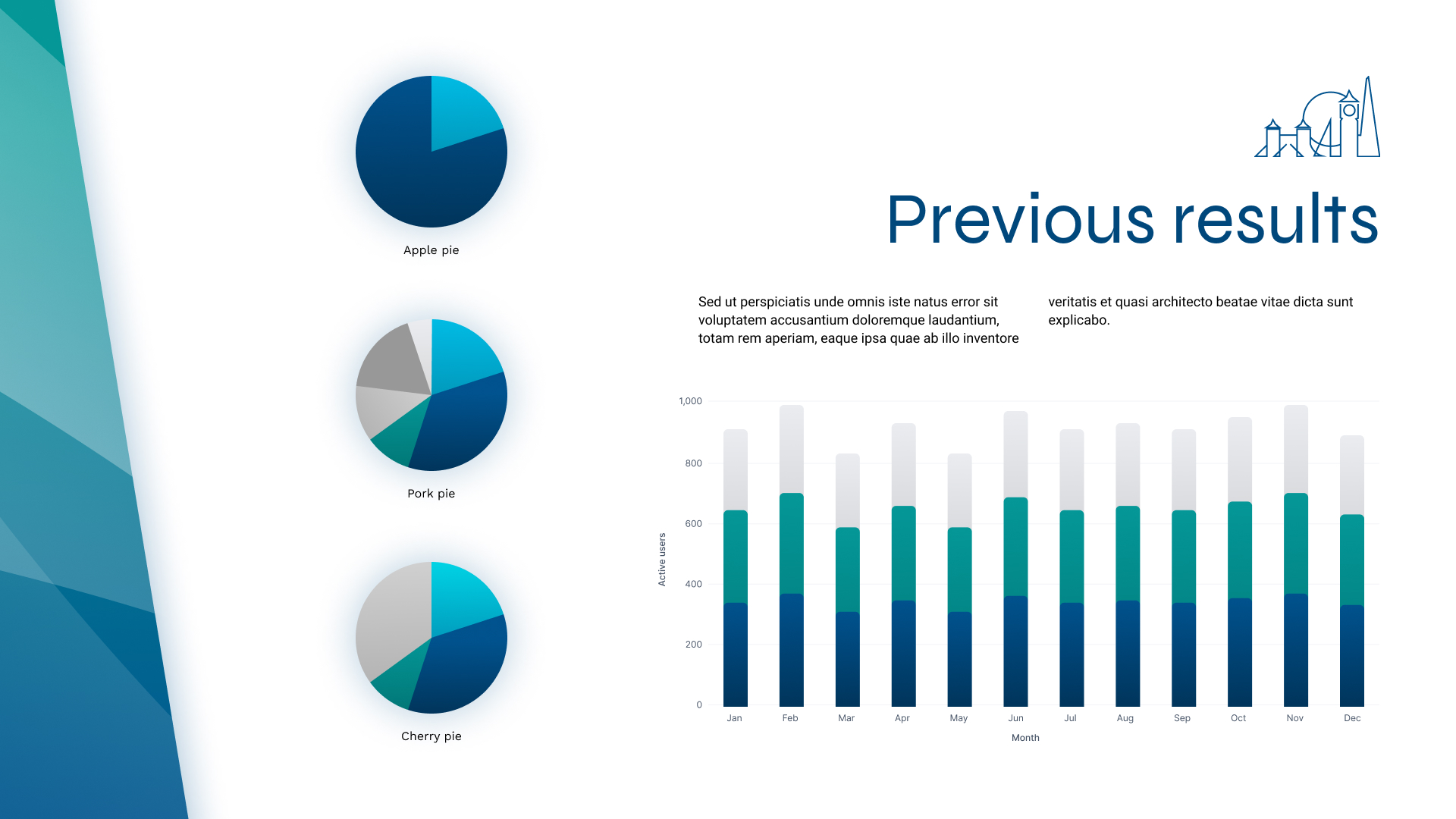
Annual report style - vector shapes

Annual report style - retro colour blocks