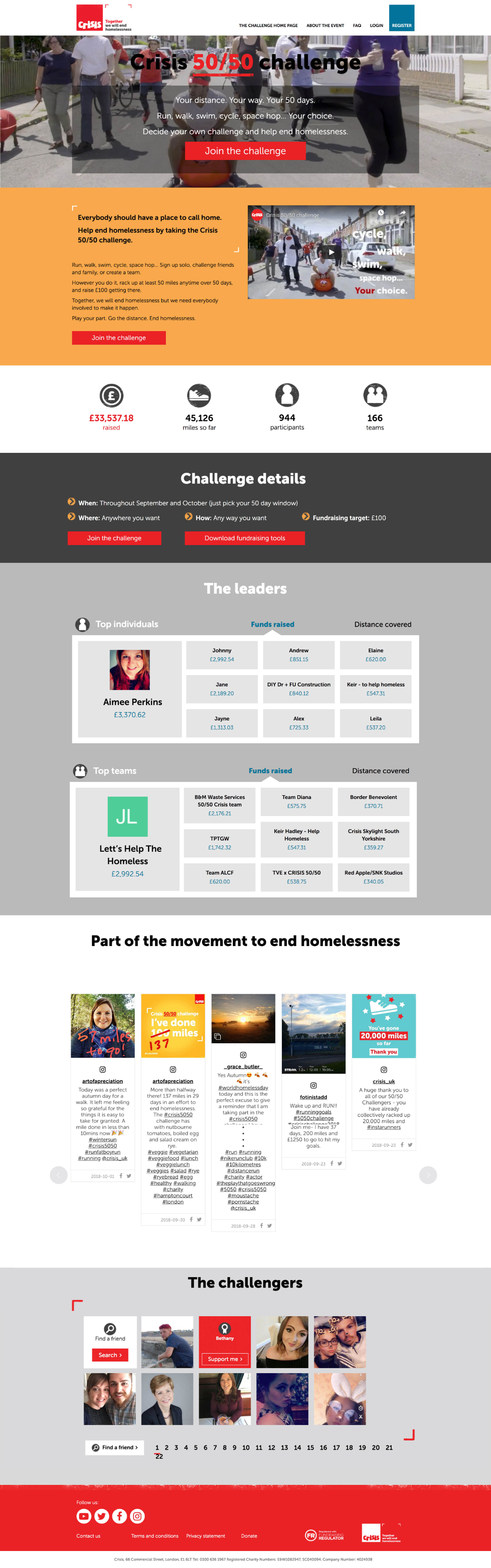
50/50 Challenge
Crisis the Homeless Charity
What
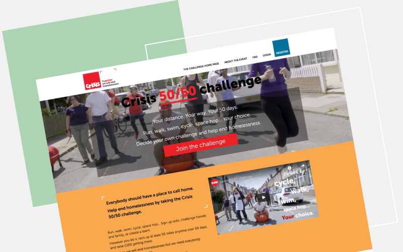
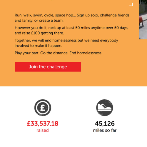
Crisis the homeless charity wanted to hold a virtual fundraising event where fundraisers were asked to cover 50 miles in 50 days, and raise £100.
They could do this any way they wanted: walking the dog, running, cycling, walking, bouncing on a space hopper...
The site is no longer live.
What we did
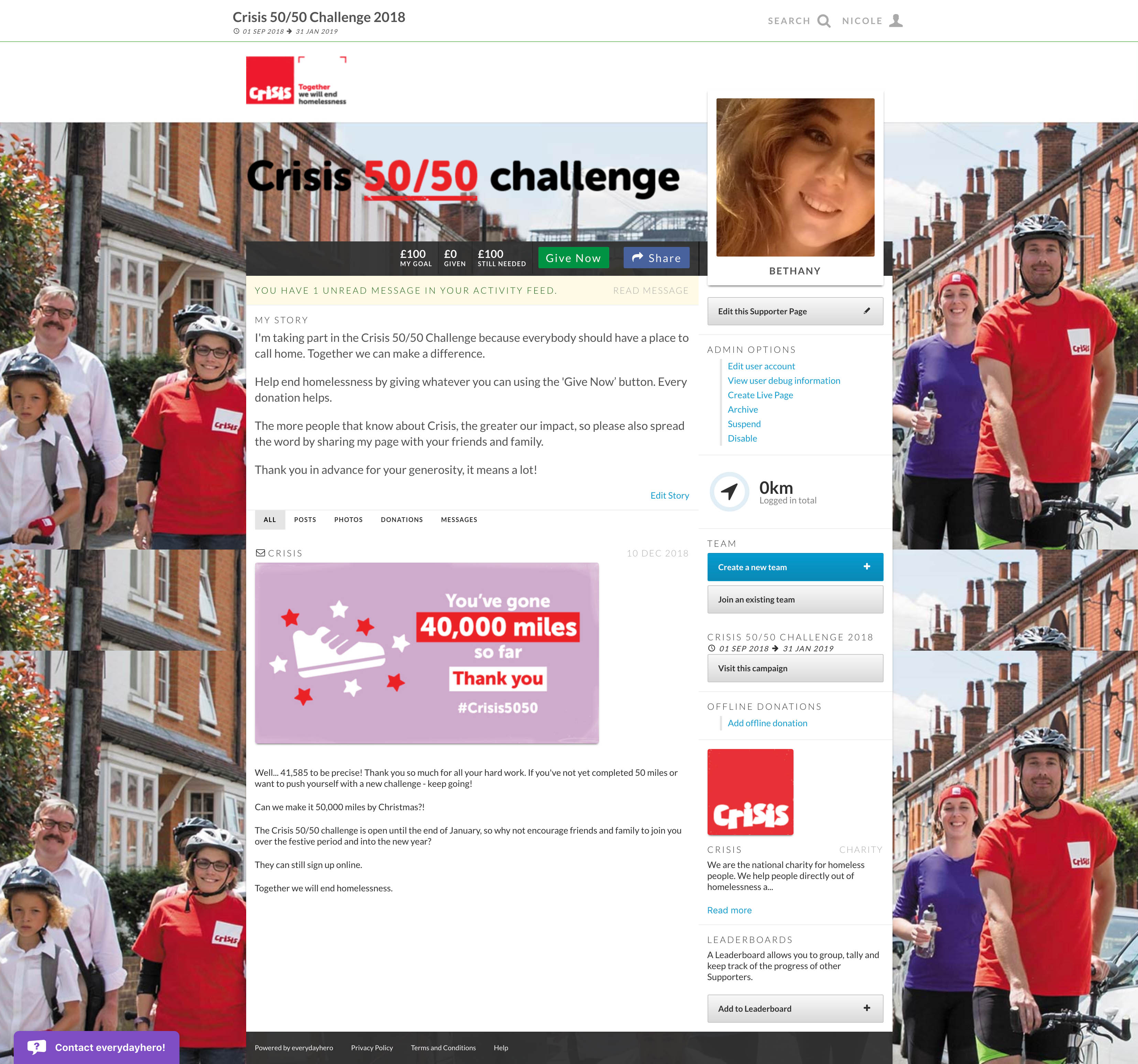
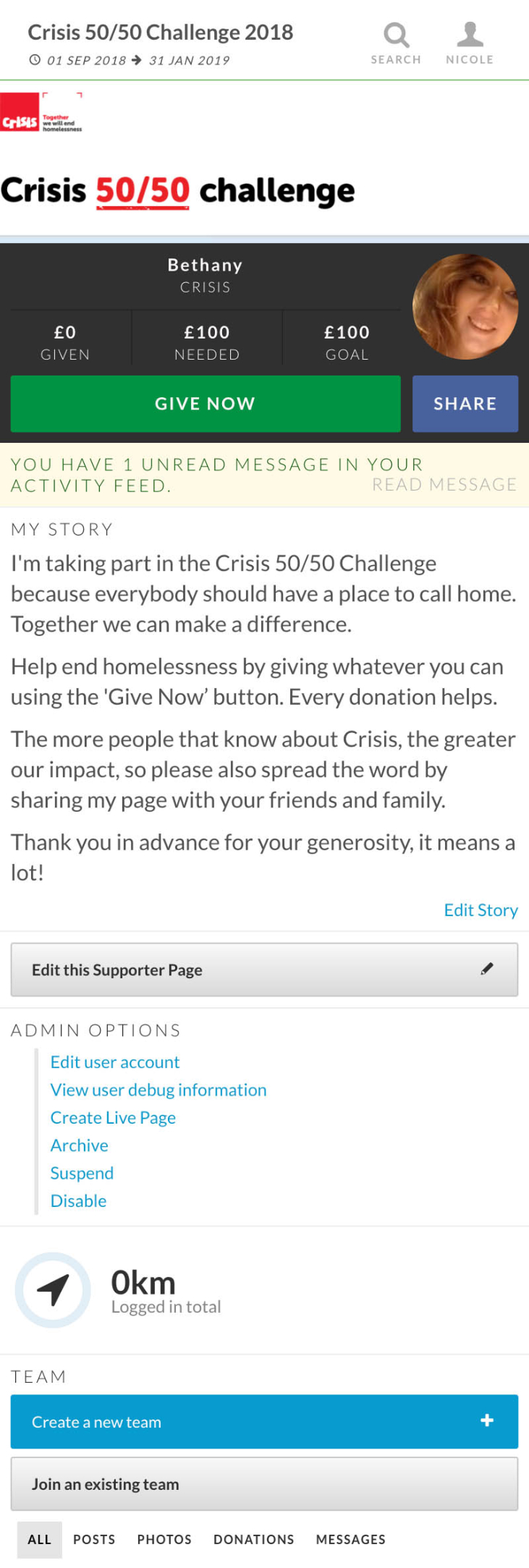
We designed a microsite based on the new, not-yet-live redesign of the main Crisis site. We built the microsite with custom HTML, the registration form, a custom thank you page, and the ability for each supporter to get their own page to collect donations and post updates.
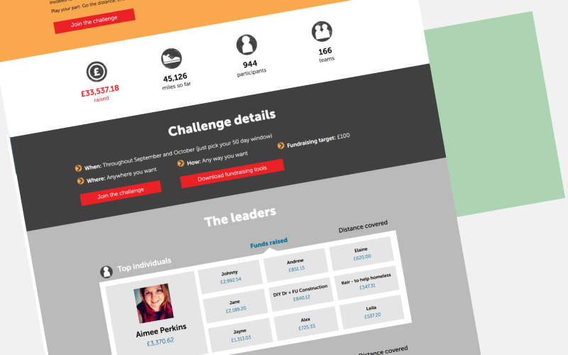
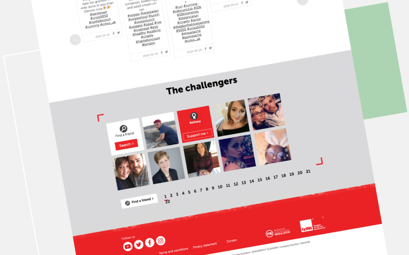
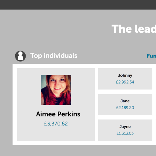
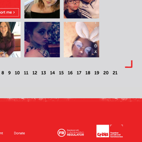
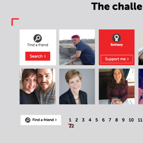
We implemented some custom widgets in the page such as totalisers, leaderboards and a supporter wall, which shows a random selection of the fundraisers (their photos, name and a button linking to their supporter page).
How
- I worked with the Design team at Crisis on the visual design, making sure that it was consistent with the new design (which I had received in the form of screenshots, which I had to keep secret!). They wanted a design that was clear and simple, using their colour palette and icons. They also had a photo shoot so I had some great imagery to work with, as well as a video that I used in the banner area of the landing page
- Once we had an approved design, I built the HTML and CSS from scratch using Bootstrap, implemented the custom widgets' Javascript and passed on the more complex JS work to the developer
- I also built the registration form, and the everydayhero campaign which collects donations and fundraiser data
- I worked with the Crisis team to make sure that they were happy with the built pages, how they display on mobiles, the user journey, form and back-end functionality. I also helped out with text changes and small issue after the pages had gone live and were being used by the supporters
- I was in constant contact with the team at Crisis for the duration of the project, collecting assets, answering questions, having weekly update calls, and making changes to the design and build based on their internal feedback. This event has run for two years in a row, so in year two I made some content updates
They said: Checkmate.
I love it! This is great. We liked the clear and simple layout and design.
Design
Home page

Supporter fundraising page